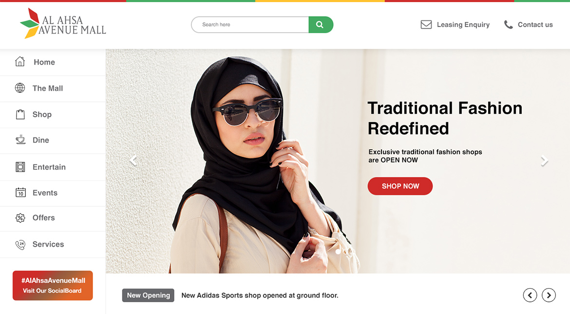
Project Brief:
The Lulu Group gave me the opportunity to update the design of the website Al Ahsa. Al Ahsa is a shopping companion web portal where users are able to check-in to stores in malls, gain points, and exchange the points to get rewards. It was a major project where I needed to re-think the user journey, and also the impact for users and business. I conducted user research, interacting with customer data & their feedbacks to understand their needs, to design and finally provide the hi-fidelity mockup design to be developed.
Problems
I created a pain points matrix from the users who used the old version of Al Ahsa portal.
Users had hard time to search for stores (where they can check-in and gain points).
They can’t filter stores and deals based on their needs.
They simply don’t know how many methods are there to gain points in order to be exchanged for rewards.
Why is it important?
The purpose of this portal is simply to help shoppers in Middle East get an amazing experience in their shopping activity, gain points, and redeem rewards while at it. We wanted to make people find their favorite stores inside a mall easier, check-in to stores and scan product barcode to gain points, and in the end they should be able to redeem their targeted reward with the points that they gained previously.
The Audience
Demographic Anyone who’s interested in shopping activities in places like shopping-centers or malls, and also the techno-savvy who is usually up to date with technology and use their smartphone to help them increase their productivity in their life.
Age Most of people who like to hangout are between 18 and 40 years old. We tend to find the skew sits quite heavily between 18 and 28 years old.
Design approach to solve the problem
What I aim for in the new UI design is to create a delightful website as a shopping companion. I conducted a user research, received matrix from business development team, and I refered to these data to develop a new interface design for the website.
Creating a sketch wireframe & user interview I drew a lot of sketch wireframes on my sketchbook to get the general feeling and whole concept of the design. With several design alternatives, I can distinguish which layout is going to work and which isn’t (from user perspective). Users should be able to quickly discover new stores that they like, and filter stores based on their interest and bank card that they use.
Solution to the problem
How did I come up with the solution was based on constructive feedbacks from users and stakeholders. With the new interface design, each of the problems can be answered efficiently through a quick produce steps, so when all is set, then I proceed to the final design and infuse the feedbacks to the design process.
Developing visual design I get a lot of inspirations from Dribbble, Behance, and Pinterest. With inspiration flowing in my head, allow me to turn the sketch wireframes into a higher fidelity mockups.
How do I know whether I came up with the right solution?
User testing & Interaction I use principle app to showcase my idea of interaction or provide clear information about page transitions and user-flow. By using prototype, it will help pitch the idea to the users and client effectively, and I could test the interaction design to the real users even before the product is developed. From there I could iterate quickly if there’s confusion and pain points in term of usability. While I did the testing, I realised there’s a moment of adaptation to the new UI from the existing users who had already get used to the old design, but with the new UI, they can achieve their goals 70% faster compare to the old UI, and users also happy with the visual design of the new UI because it looks fresh and modern.